Overview
ggastrum provides color palette functions that work with
base R graphics. The solaris_pal() function generates a
warm blue-red gradient.
Solar Palette
The solaris palette provides five distinct colors suitable for categorical data:
# Generate palette colors
cols <- solaris_pal(5)
print(cols)
#> [1] "#3B0A45" "#452B7B" "#2E6E8E" "#44BD6B" "#FFD700"
Base R Plot Examples
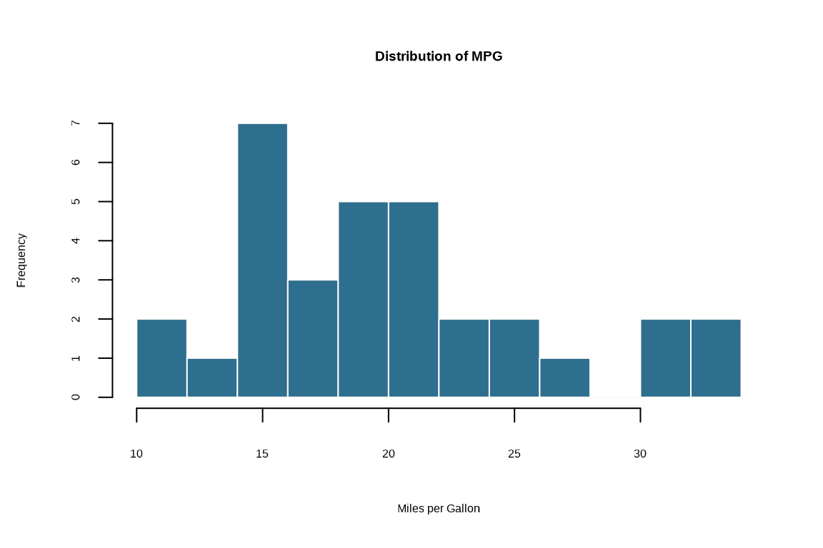
Histogram
# Simple histogram with solaris colors
hist(
  mtcars$mpg,
  breaks = 10,
  col = cols[3],
  border = "#fcfaf7",
  main = "Distribution of MPG",
  xlab = "Miles per Gallon"
)
Bar Plot
# Bar plot using palette
barplot(
  VADeaths[, 1],
  col = cols,
  main = "Virginia Deaths (Rural Male)",
  xlab = "Rate per 1000",
  border = "#fcfaf7"
)
Pie Chart
# Pie chart with palette colors
pie(
  rep(1, 5),
  labels = paste0("Group ", LETTERS[1:5]),
  col = cols,
  main = "Solaris Palette"
)
Scatter Plot
# Scatter plot with palette colors
plot(
  mtcars$wt,
  mtcars$mpg,
  xlab = "Weight (1000 lbs)",
  ylab = "Miles per Gallon",
  main = "Fuel Efficiency vs. Weight",
  pch = 19,
  col = cols[1]
)
Grid Helper
Use grid_solaris() to add subtle grid lines to your base
R plots:
plot(
  mtcars$wt,
  mtcars$mpg,
  pch = 19,
  col = cols[1]
)
grid_solaris()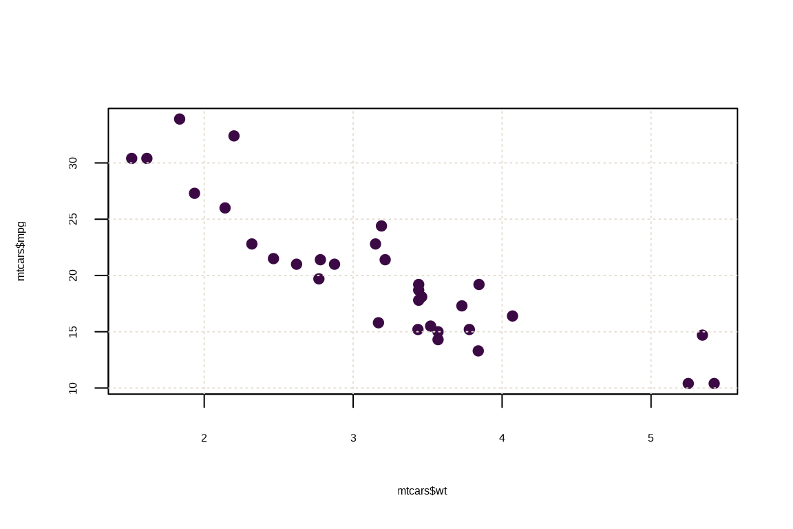
Palette Options
All four palettes are available:
viridis_pal(5)
#> [1] "#440154FF" "#3B528BFF" "#21908CFF" "#5DC863FF" "#FDE725FF"
inferno_pal(5)
#> [1] "#000004FF" "#56106EFF" "#BB3754FF" "#F98C0AFF" "#FCFFA4FF"
grayscale_pal(5)
#> [1] "#000000" "#6D6D6D" "#959595" "#B3B3B3" "#CCCCCC"
solaris_pal(5)
#> [1] "#3B0A45" "#452B7B" "#2E6E8E" "#44BD6B" "#FFD700"