Overview
The package provides four color palettes:
-
viridis: Perceptually uniform, colorblind-friendly
(default for
theme_t2m()) -
solaris: Slight variation on viridis: Warm gold to
deep purple palette with a cream background (default for
theme_solaris()) - inferno: Similar to viridis but with a dark background
- grayscale: Clean black-to-white gradient
Discrete Palette Comparison
Compare all four palettes using the same categorical data:
p_solaris <- ggplot(mtcars, aes(wt, mpg, color = factor(cyl))) +
  geom_point(size = 3) +
  scale_color_solaris_d() +
  theme_solaris() +
  labs(title = "solaris", color = "Cylinders") +
  theme(legend.position = "none")

p_viridis <- ggplot(mtcars, aes(wt, mpg, color = factor(cyl))) +
  geom_point(size = 3) +
  scale_color_viridis_d(option = "D") +
  theme_t2m() +
  labs(title = "viridis", color = "Cylinders") +
  theme(legend.position = "none")

p_inferno <- ggplot(mtcars, aes(wt, mpg, color = factor(cyl))) +
  geom_point(size = 3) +
  scale_color_viridis_d(option = "A") +
  theme_t2m() +
  labs(title = "inferno", color = "Cylinders") +
  theme(legend.position = "none")

p_grayscale <- ggplot(mtcars, aes(wt, mpg, color = factor(cyl))) +
  geom_point(size = 3) +
  scale_color_grey(start = 0.2, end = 0.8) +
  theme_t2m() +
  labs(title = "grayscale", color = "Cylinders") +
  theme(legend.position = "none")

(p_solaris | p_viridis) / (p_inferno | p_grayscale)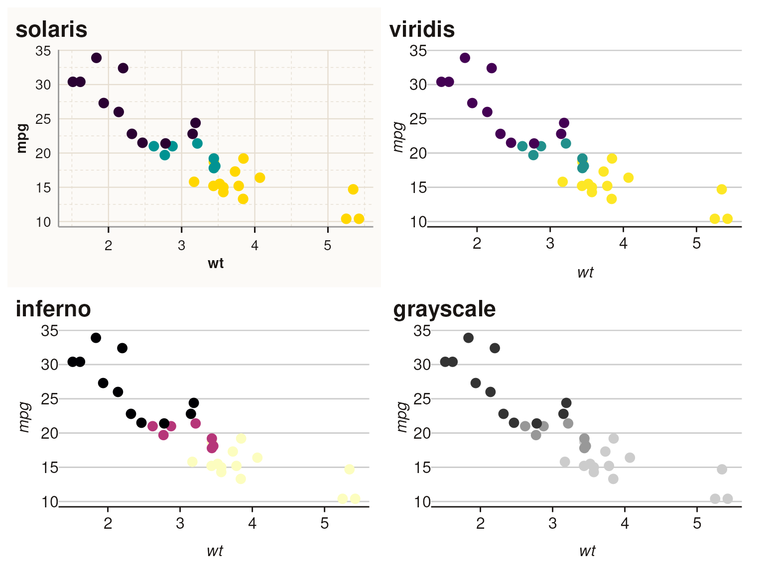
Continuous Scale Comparison
Compare continuous color scales:
p_solaris_c <- ggplot(faithfuld, aes(waiting, eruptions, fill = density)) +
  geom_tile() +
  scale_fill_solaris_c() +
  theme_solaris() +
  labs(title = "solaris") +
  theme(legend.position = "none")

p_viridis_c <- ggplot(faithfuld, aes(waiting, eruptions, fill = density)) +
  geom_tile() +
  scale_fill_viridis_c(option = "D") +
  theme_t2m() +
  labs(title = "viridis") +
  theme(legend.position = "none")

p_inferno_c <- ggplot(faithfuld, aes(waiting, eruptions, fill = density)) +
  geom_tile() +
  scale_fill_viridis_c(option = "A") +
  theme_t2m() +
  labs(title = "inferno") +
  theme(legend.position = "none")

p_grayscale_c <- ggplot(faithfuld, aes(waiting, eruptions, fill = density)) +
  geom_tile() +
  scale_fill_gradientn(colours = grDevices::grey.colors(256)) +
  theme_t2m() +
  labs(title = "grayscale") +
  theme(legend.position = "none")

(p_solaris_c | p_viridis_c) / (p_inferno_c | p_grayscale_c)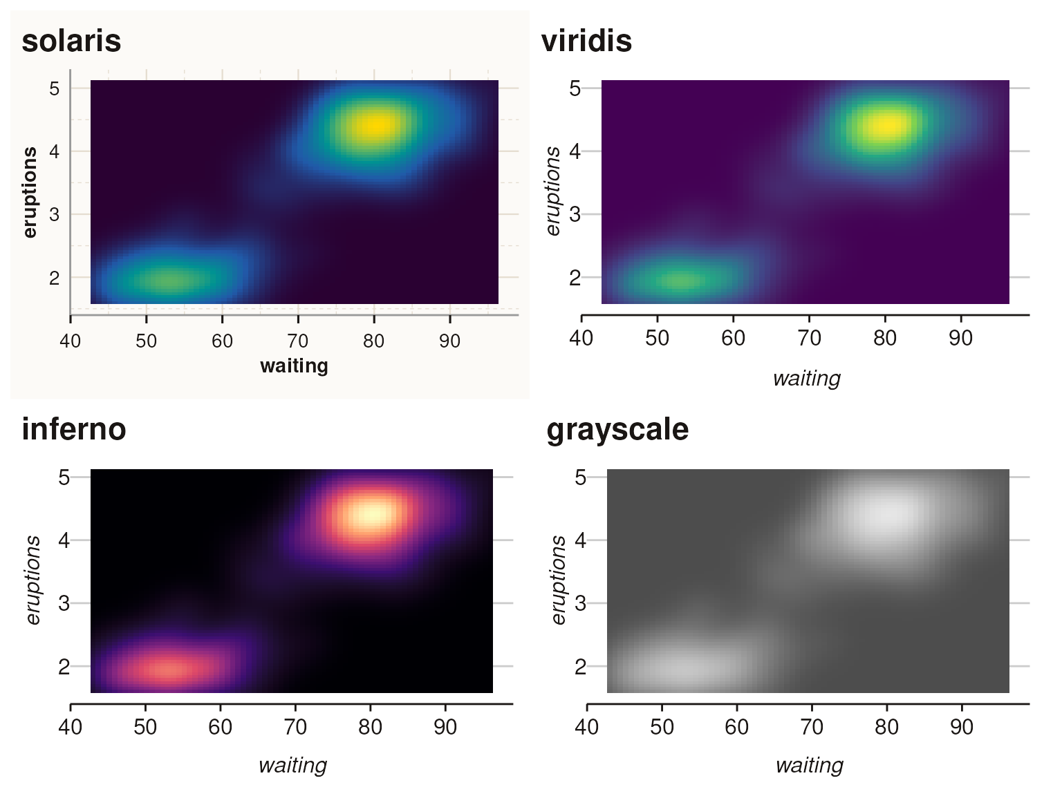
Discrete Categories > 6
The solaris palette automatically interpolates for categories greater than 6:
# Create data with 10 categories
df <- data.frame(
  x = rep(1:10, each = 10),
  y = rep(1:10, times = 10) + rnorm(100, 0, 2),
  group = factor(rep(1:10, each = 10))
)

ggplot(df, aes(x, y, fill = group)) +
  geom_col(position = "dodge") +
  scale_fill_solaris_d() +
  theme_solaris() +
  labs(title = "Solaris: 10 Categories (Interpolated)", fill = "Group")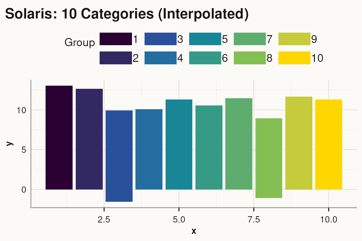
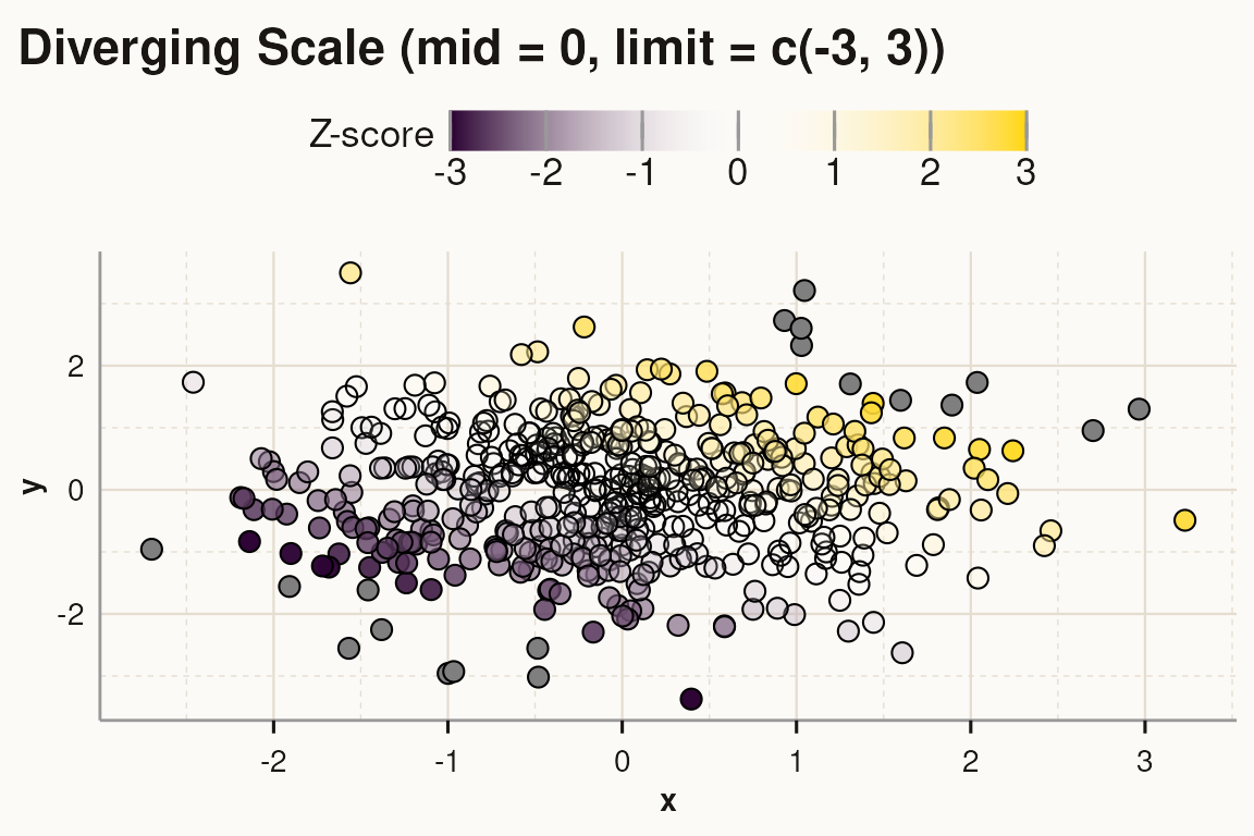
Diverging Scales
Use scale_fill_solaris_div() for diverging data (e.g.,
z-scores, correlations):
# Create sample data with positive and negative values
df_div <- data.frame(
  x = rnorm(500, 0, 1),
  y = rnorm(500, 0, 1)
)

ggplot(df_div, aes(x, y, fill = x + y)) +
  geom_point(shape = 21, size = 3) +
  scale_fill_solaris_div() +
  theme_solaris() +
  labs(title = "Diverging Scale (solaris_div)", fill = "Value")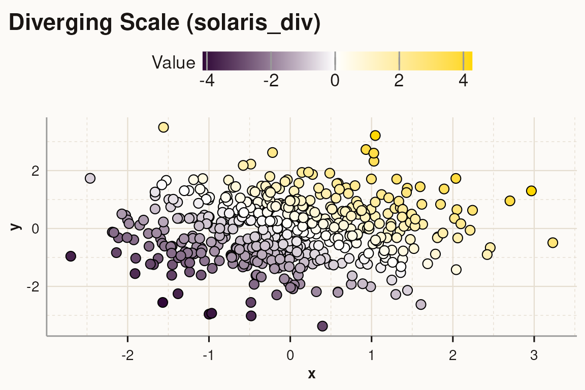
Customize the midpoint and limits:
ggplot(df_div, aes(x, y, fill = x + y)) +
  geom_point(shape = 21, size = 3) +
  scale_fill_solaris_div(mid = 0, limit = c(-3, 3)) +
  theme_solaris() +
  labs(title = "Diverging Scale (mid = 0, limit = c(-3, 3))", fill = "Z-score")